AI is a beautiful trap to those who don't care
There are countless articles, texts and videos online about AI to the point where I'm just sick of reading, learning about, hearing about or even thinking about AI in general, specially because I'm a declared huge AI hater, although I use it on my day-to-day basis and try to be as much up to date and knowledgeable as possible because my job and carreer requires it. However, credit where credit is due: AI is useful. If you think AI is not useful, you're just lying to yourself and to be fair that's ok, you do you.
The problem is that AI is "too useful", so useful that it's just tempting to turn off your brain and just ask "claude please solve my life" and let the agent do everything for you. This is "kinda ok" in situations you really don't care about (e.g. helping do my taxes or writing CRUD boilerplate), but learning/studying is a total different story, specially when it's learning something 1. that I like; and 2. that aggregates to my carreer. And, since I'm a software engineer that plays with computers for how long as I can remember, coding fits in both scenarios to me.
For that reason, I deprived myself from using AI in my personal projects since the release of ChatGPT, with the sole exception of using it as a quick search engine for small concepts. I don't regret that, and I'll still not use it for the majority of my projects, mostly because I really like writing code by hand and the whole research process, but even in some personal projects there's always something I don't like. Don't get me wrong, I love coding, all kinds of it, but I've written so much web front-end code in my life that I just can't do it anymore without the urge to cut my hands off (it's ok when it's for my job because it's part of the job, but in my free time? Nah, screw that).
"Oh, then why didn't you use LLMs to generate that boring part for you before?"
- You (probably)
Besides liking to write code and the research process, there are other two reasons why I avoid AI when studying: learning and one other I'll talk about later. Coding, just like math or exercising, is something you just learn by practicing it. If you stop writing code (or even a specific type of code like web or Android) you'll just unlearn it, that's the harsh truth. If you stop solving problems your brain won't work when you really need it.* However, I... really really don't want to write web UI anymore in my spare time. And I really didn't need to do it for a long long time... But now I really wanted/needed a new website and a personal blog which is something I had in the past but never put that much effort into it. I thought to myself "Ok, I don't want to write this... What if...".
*: I won't get into the discussion of whether "knowing how to code is still relevant in the AI era" because I'm sick and tired of that.
If you want to discuss that just go to LinkedIn and scroll about 3 or 4 posts and you'll find something.
How I envisioned my website
I'm no designer, nor I consider myself the most creative guy out there, specially when it comes to UI-design. So when I first started thinking about how I wanted my website to look like I was completely clueless. So I started brainstorming some ideas:
- "Ok, what do I like? I like food, coding, games, snakes and reptiles, music, anime and cartoons, movies... damn I like many things... let's pick three: games, coding and snakes".
- "What should I pick from each of them? I don't think I really need to add anything related directly to coding, but I can have some 'tech-like' aesthetic... I know! Squares!".
- "Cool, now games. This is the easiest, I think picking a gamefied font or even adding some cool animations later on that reminds retro games... Yeah, let's go with a pixel-like font for now".
- "And now the tricky part: how the hell do I add snake elements to this? I think colors and later on we can add some symbols or animations or even custom avatars that remind snakes! Yeah, cool, let's start with the color... But I don't like green. Oh! I know, black mambas are blue-ish, so I'll start with a black mamba like blue background!".
- "Next step: overall layout, base content, and tech. I want to include my name, my email, a link to my github and linkedin, my job and years of experience with it. With the blue background everything will be dark mode by default, so that's cool by me. I also want things to look good in mobile and it should be accessible to everyone, specially because it's so simple. I don't want anything fancy like using web libs/frameworks, SSR, or anything like that, just plain HTML+CSS+JS is more than enough. It should also work without JS because I respect people who disables it."
- "Ok, now I just need to code it... Ugh, do I have to...? It should be easy and all, but I'm working on other stuff that is so much more interesting than a boring website... And I don't even really really know how I want it to look like, so I'd have to look for references, think, try alternatives, come up with ideas... Jesus, this is just a simple website, do I need to go through all of this? Ok, let's try this."
I kid you not, this was legit my thought process.
Writing the first prompt
So yeah, I've decided to throw all that into Codex+Astra. I didn't want to make it too loose, so I had some constraints in mind. I was pretty mindful that it was going to throw the most slop-like design ever on top of the most slop and overengineered code base ever. Although I didn't want to code it, my personal projects are part of who I am, so I wanted to make sure both the design and the code would look like something I would write. That said, this was the exact prompt I've used: (No need to read all that, there's a TL;DR at the end)
hey pal, I want you to start helping me with my personal website + portfolio.
I'll start dumping some info here so we can start designing them together.

First things firts, technology and constraints:
- We should use only Javascript, HTML and CSS. No typescript. No npm or any
other package manager. No external dependencies unless I explicitly say so.
No need to have SSR, what the user asks is what they get;
- Everything should be versioned (I've already initiated a git repo in the
current directory);
- The priorities are readability, accessability and performance. The project
should be able to work on both desktop and mobile seemlessly. The project
should be able to work without Javascript. The project should fully support
screen readers;

Development flow/code contracts (add this to a local AGENTS.md):
- All texts produced (possible docs, comments, etc) should go through
https://github.com/ayghri/i-have-adhd (you should probably install it);
- The code produced should go through
https://github.com/DietrichGebert/ponytail for maximum simplicity;
- You should not assume intentions after each prompt, the code should reflect
exact what the prompt asked for, no deps download, no elaborated code
decisions, no fancy logic;
- I'll also write code, you'll be my assistant;
- You can also help me design the app -> We can go through some
brainstorming/back-and-forth discussions to reach design choices;
To make decisions and communication easier you should generate pages and/or
images to match our central discussion until we can agree on a final design
for said page/feature -- the generated content should be placed in tmp folders,
feel free to use whichever setup you'd like for the generated pages (e.g.
download depencies, SSR, third-party libs, no ponytail or adhd, etc) since
they're not going into the final product; After we agree in the final state
of the design for the feature, you should take note of what we're trying to
achieve i.e. we'll use that as a guideline for the finish line;
- You should NEVER commit any document (except README.md's and AGENTS.mds).
This whole first prompt should be clarified in the AGENTS.md (before actually
writing it for the first time,   feel free to improve the file to better fit
the AGENTS needs and understanding -- I should be able to spawn new agents to
handle that for me exactly as you would);
- As I mentioned before you'll be my assistant here, so I'll use your help to
write boilerplate, more complex logic to save time, etc, but there'll be code
that I'll also write. That said, there will be times where I'll ask for your
review. This review should not take too long to complete, it should be a rather
shallow one just looking for code quality, local intent (e.g. the functions I'm
using actually exist? Is there any possible bad code logic anywhere? Possible
bugs?), accessibility and readability in case of UI changes, project pattern
matching (e.g. am I using snake_case just like in the rest of the project? line
spacing? basically linter job + code format + minor structure vanity). For stuff
that requires structure changes, just report them. For vanity formatting (like
the casing, line spacing, etc examples) you can fix it in-place and report back
what you found vs what you did;

For starters: write the AGENTS.md, a simple README.md, and a basic project
structure containing three dirs (src, css, html, assets) and one file in each:
the src directory should contain only JS files (for now add a simple index.js
with a console.log to show anything in the console), the css directory should
contain only css files (for now add a index.css with some style resets (margin:0,
padding:0, etc, the default stuff)), the html directory should contain only
html files (for now add a index.html importing both js and css files, already
following all my instructions above, with a single h1 with "Jansen Saunier" in it),
the assets dir will be used to have images, fonts, etc (for now just add a single
.keep file).
TL;DR:
- Locked in which technology to use in the project;
- Specified main focus of the project and what priorities to tackle: readability, accessability and performance;
- Made sure it used both i-have-adhd for text generation and ponytail for code generation. Both these skills were absolutely necessary, the generated code was sane and I was able to really understand what the agent and its docs were saying without too much thinking (at least for the most part of it).
- I gave it basically 2 main job profiles: help me with designing and prototyping the project and future features, and review changes I've written whenever I ask for.
I had to tweak the rules and job profiles a little bit but the main idea was there: the agent would never do the project for me. I'd have it generate prototypes based on my current codebase for features, designs, etc, then I'd tweak the prototype using the agent + some manual code changes and after that I'd implement it line-by-line by myself. All the boilerplate was being generated, so I could read and copy all the boring parts I've done thousands of times in the past. I could read the diffs, rewrite what I did not agreed with (and dare I say there were a LOT of stuff I didn't), rewrite, debug and try to understand parts I didn't and rewrite them into something I did, etc. This was really useful for mainly two things: accessability (because I SUCK at aria stuff) and math/graphic logic because it's been so long since I played with it I'm really rusty (more on that later).
The first version
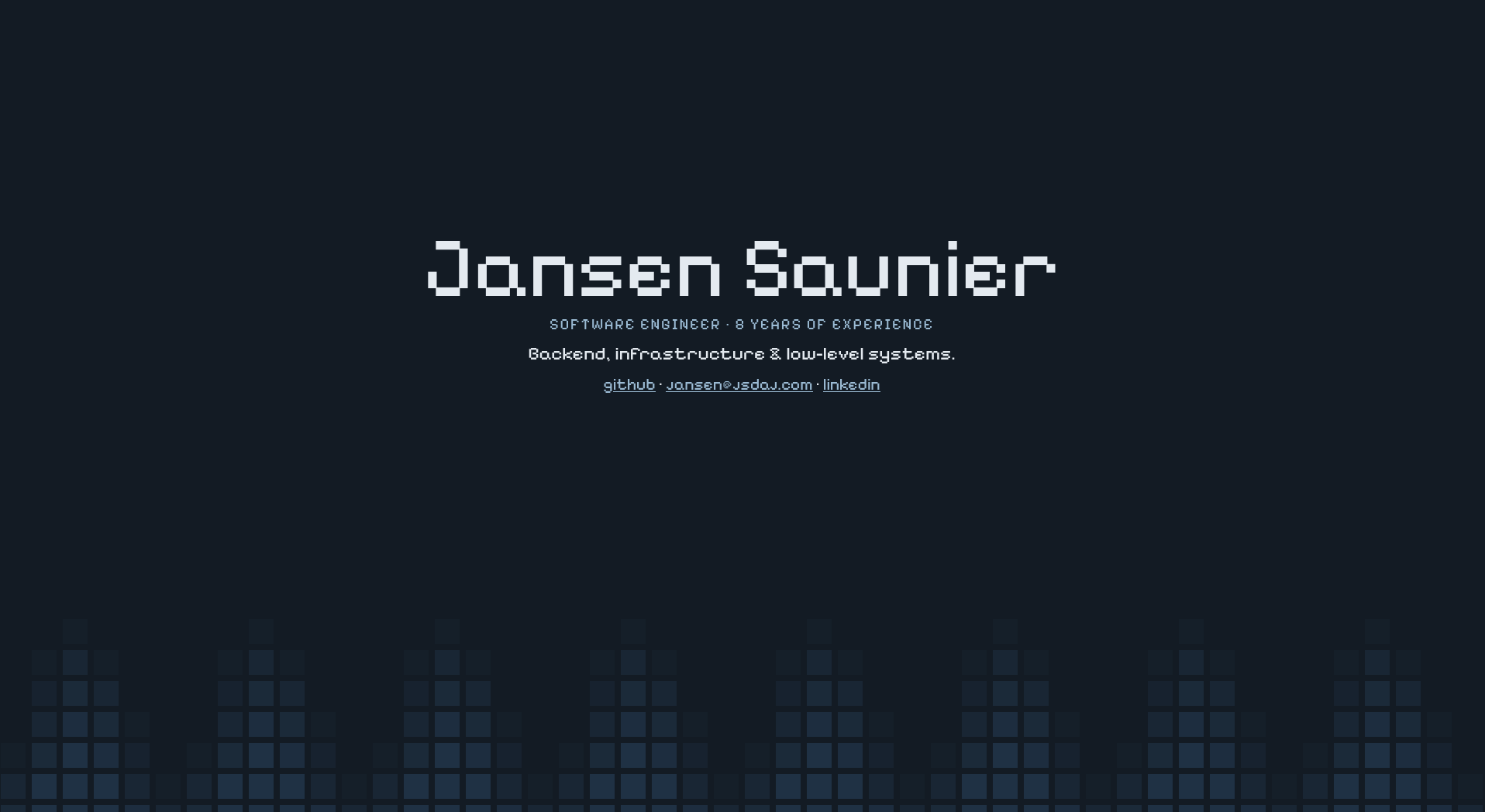
After some back and forth the first version was finally created. Needless to say this version sucked. It was literally what you expect from AI slop: everything beautiful at first, but it keeps getting worse and worse as you start paying more attention. A lot of the text didn't even make sense, page elements that didn't aggregate anything to the page, "fun facts" about me I've barely mentioned, and the layout looked like something you'd see after googling "personal website portfolio example". I REALLY wanted something with less content, something more straightfoward and simple. I spent quite sometime tweaking it with the agent. "Remove this", "rename that", "centralize those"... And then it became something that was going to be the base for my current home page:
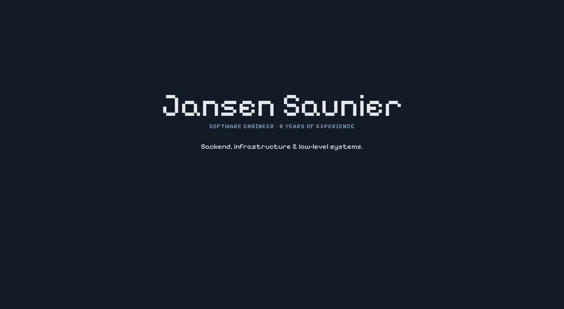
It was simple and straightfoward enough and overall most of the layout came from me after playing around, so I was pretty glad with the results. Problem: too simple. So simple it was boring. And more important: no squares!! How people would know I'm into computers if there are no squares?? Outrageous. After looking the first design version my immediate reaction was to add a square-based semi-circle border below the main content. After testing it looked like this:
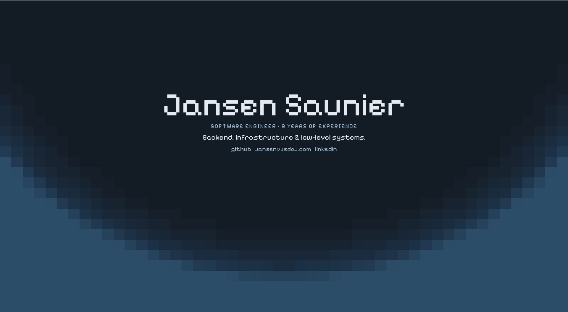
It... was not exactly what I wanted, and I was also kinda struggling to make GPT understand what I really wanted. Good news is that this atrocious try
to implement what I had in mind made me realize it was not a good idea to begin with, but the circle-like shape reminded me of a concept I really
love: waves. Since my first OpenGL code I've always loved to play around with sin/cos functions to generate waves or oscillations in
graphics, so I just asked Ok GPT, make waves!
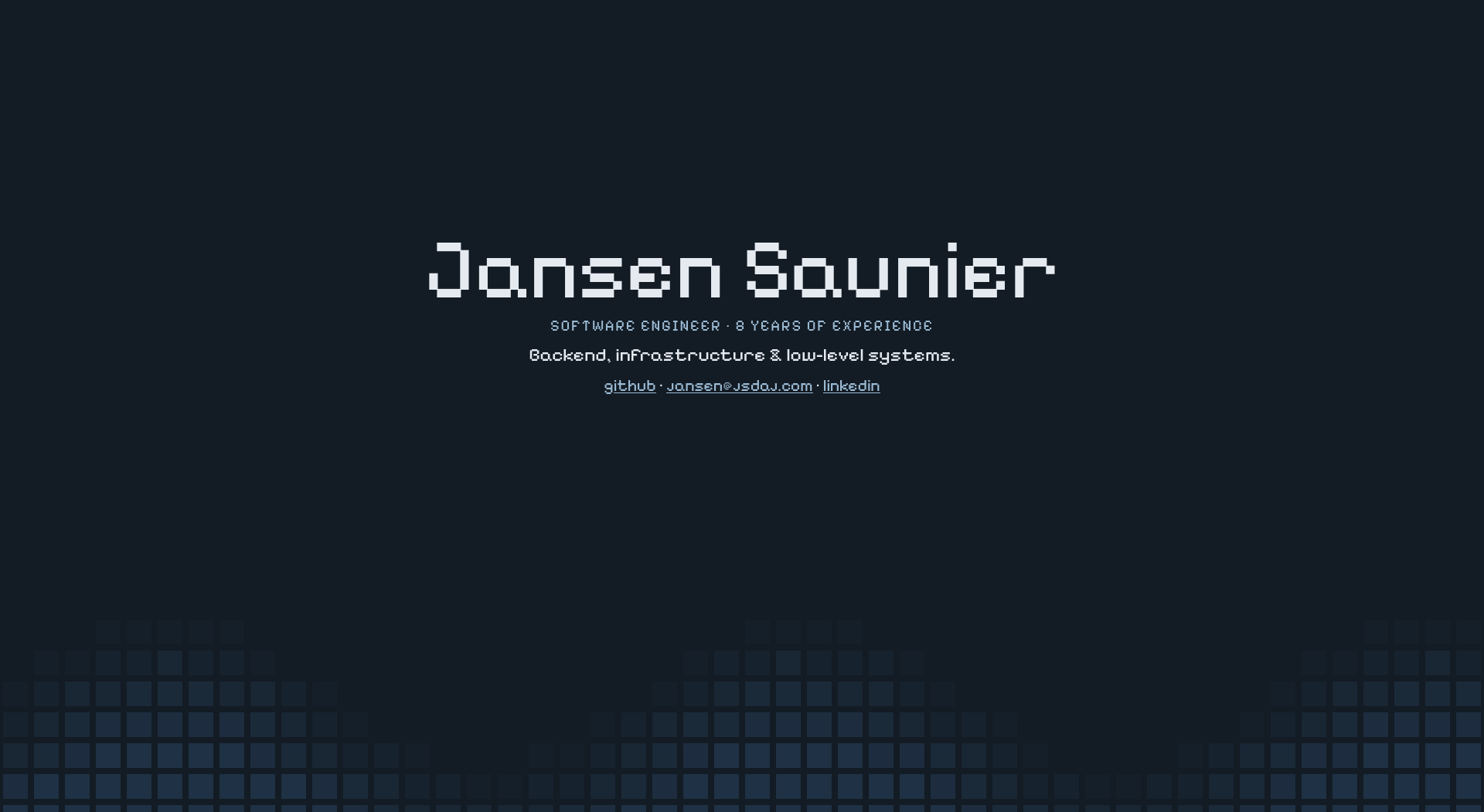
YES! That's basically what I wanted! Sure, it needed a little tweaks here and there but the main idea was alive, everything else I could do by myself. Just like that, all the boring parts were gone and there remained only some tweaking with drawing functions which is something really cool to do, and code-reading and refactoring which I also enjoy for the most part. With the prototype aligned with my expectations, I kissed GPT a good-bye and started reading, copying, formatting, rewriting, etc etc.
Getting my hands dirty
The whole process of "converting" GPT code into my own took some time. Mostly because I spent a good portion of it complaining "why the hell would you do
that? Why do you have this invisible element? Why the logic looks like that? Oh, that's a clever idea!". With the GPT code I saved a good amount of
time with basic HTML and CSS, learned some neat DOM tricks in the process, had to delete a bunch of code and change even more. This overall took way
longer than the prototyping phase but I've learned some cool stuff I didn't know or never even had to think about. One cool example that is very much
known for seasoned web veterans but I never actually used: the whole animation was built by constructing a SVG in runtime and animating with
requestAnimationFrame. I've never had to use it. I did some animations like that before but I've always used the canvas
element with setInterval to run update cycles. As a matter of fact I didn't even know about requestAnimationFrame.
So cool!
During the rewriting process I came across how it was constructing the SVG component:
function resize() {
    const width = wave.clientWidth;
    const height = wave.clientHeight;
    wave.setAttribute("viewBox", `0 0 ${width} ${height}`);
    wave.replaceChildren();
    cells.length = 0;
    for (let row = 0; row < Math.ceil(height / 32); row++) {
        for (let col = 0; col < Math.ceil(width / 32); col++) {
            const square = document.createElementNS(namespace, "rect");
            square.setAttribute("x", col * 32 + 3);
            square.setAttribute("y", row * 32 + 3);
            square.setAttribute("width", 26);
            square.setAttribute("height", 26);
            wave.append(square);
            cells.push({ square, x: (col + .5) * 32 / width, y: (row + .5) * 32 / height, level: -1 });
        }
    }
    draw();
}
Wait... So it's building a grid over the whole screen?? So in theory I could move the wave to the top just by tweaking the draw function? Maybe I could even draw more elements? Since it's a grid I could even run game-of-life and what-not? That's so cool! Where's the draw function?
function draw() {
    const phase = elapsed / 4250;
    for (const cell of cells) {
        const position = (cell.x - .5) / .425 + .5 - phase;
        const crest = (1 + Math.cos(2 * Math.PI * position)) / 2;
        const curve = 1.03 - 0.19 * Math.pow(crest, .95);
        const strength = Math.max(0, Math.min((cell.y - (curve - .10)) / .18, 1));
        const level = Math.round(strength * 6);
        if (level !== cell.level) {
            cell.square.setAttribute("fill", colors[level]);
            cell.level = level;
        }
    }
}
- my legit reaction.
Ok, to be fair this is not something really complex. You can see there that the waves are made using cos function which is expected, there's some modifiers to said function basically to position it, and there's some "strength" variable that's used index the colors array. However there are some details (more specifically those magic numbers) that the LLM threw in there that made me scratch my head. Let's start breaking that down.
How to draw waves
The code starts with const phase = elapsed / 4250;. "Phase" is a very weird name for this IMO but it's basically a time variance we can
use to make the wave move (I just renamed it to delta). elapsed is the sum of how much time has passed since the
page first loaded in ms. And 4250 is the first magic number, but given what I said you can probably figure out what it means: animation cycle time.
Basically the wave takes a total of 4.25 seconds to move from the left to right side of the screen.
The next interesting line is const position = (cell.x - .5) / .425 + .5 - phase;. Before understanding this one we should make it clear
the coordination system it's using for cell.x. Going back to resize function's line where it pushes the cell into the cell array:
cells.push({
    square,
    x: (col + .5) * 32 / width,
    y: (row + .5) * 32 / height,
    level: -1
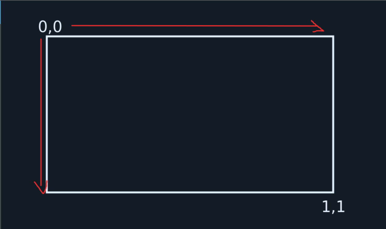
});32is the cell size;colandroware the current grid position;.5is basically positioning x and y to the center of the cell instead of the top-left corner;- And the division by width and height is to normalize the coordination system between 0 and 1;
In practice this means that whenever we're refering to cell's xs and ys, we're looking to a plane like this:
Getting back to the position calculation. This position variable will be fed into the cos function, so this is the value that will
dictate movement and graph shape, basically it's the position of that cell in the cos graph. The second magic number we're
looking at is 0.425. One cool trick whenever you're dealing with sin/cos functions: if you multiply the input value it will
alongate/shrink the sign wave, if you sum/sub it will move the graph around. 0.425 is dictating how long the wave is, which means that
if I increase it's value the peak cycles in the wave will be more constant. For example, when I change it to 0.125 this is what I get:
The -.5 and +.5 part is just a positioning logic to make sure that in the middle of the screen there's always a valley and never a peak when first loading
the page, this only works because later we multiply it by 2*PI which causes the wave to shift a whole cosine cycle, if we were not multiplying by it then
the -.5 +.5 operation would be basically useless. Also remember that for all effects .5 at this stage means "half the screen" as long as the cell
coordination system goes, which fits nicely with this moving approach. You can play around with it
here in Geogebra, notice that .5 is always a valley independently
of the value you use in place of 0.475.
And at last - phase makes the wave move over time. Cool, position makes sense now. Next:
const crest = (1 + Math.cos(2 * Math.PI * position)) / 2;
const curve = 1.03 - 0.19 * Math.pow(crest, .95);
Crest is basically a "normalized position":
- First of all cos waves are between -1 and 1, and for this to work we need to have it between 0 and 1. Easy way to handle it: if we add 1 to it the new interval is now between 0 and 2, and if we divide by 2 the interval is between 0 and 1;
- I've explained why we needed to multiply by 2*PI before;
The "curve" variable is the actual cos curve function after some modifications:
Math.pow(crest, .95)is not very different from the .475 in the position variable: it just alongates and shrinks the function cycles.- 1.03 and 0.19 are modifiers to the actual curve: multiplying the function makes cycles taller, adding/subtracting moves the function in y axis. This means that 0.19 makes the cycles about 20x shorter and 1.03 moves the function to the bottom of the screen.
I have NO CLUE why it opted to use 1.03 instead of just a plain 1.
And now the last part of the draw function:
const strength = Math.max(0, Math.min((cell.y - (curve - .10)) / .18, 1));
const level = Math.round(strength * 6);
if (level !== cell.level) {
    cell.square.setAttribute("fill", colors[level]);
    cell.level = level;
}